Review: Troy Dugas at Arthur Roger Gallery

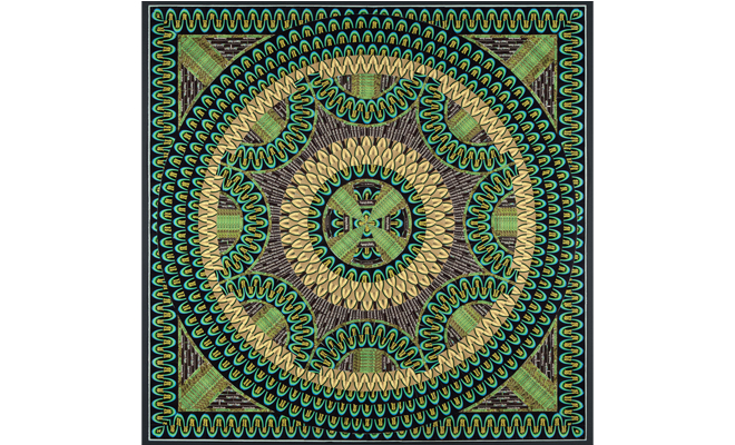
Troy Dugas, Jewel Pride, 2012. Vintage labels mounted to paper. Courtesy the artist and Arthur Roger Gallery, New Orleans.
Meant to instruct in the art of attentiveness, a mandala is a visual aid used in Hindu and Buddhist meditation. In classical form, the design contains four “gates” that guard a central circle. An honest rhetorical question then: do make-your-own-mandala websites and Urban Outfitters' mandala bedspreads undermine the significance of this mystical emblem? This isn’t to scoff at the mandala’s new pop-Zen identity, but to witness the mandala moment while trends, and the technologies that are their silent backdrop, become increasingly antithetical to its symbolism and utility is bizarre.
Young American artists like Sanford Biggers and Vandana Jain have made mandala-based work for over a decade that probes exactly that ambivalence, and last year Atlanta’s Emory University organized a program of exhibitions, lectures, and demonstrations anchored around it. Over the past several years, Troy Dugas, who collages paper product labels onto flat surfaces in patterns approximating mandalas, has become the contemporary artist perhaps most invested in the form. Despite Arthur Roger Gallery’s press-release reference to Dugas’ “familiar mandala-like compositions,” the Lafayette-based artist has mostly avoided the word to describe his work. Perhaps he could already perceive the mandala’s cultural drift toward empty signification.
The pieces in Arthur Roger’s large front room are labor-intensive, airtight, and very “mandala-like” collages. Whereas previous bodies of work seemed almost to mimic embroidery, the look is more consciously modernist here, owing largely to Dugas’ specific choice of product labels. Whether mining the packaging of green beans, liquor, or cigars, a wallpapery and impeccably LBJ/Nixon-era aesthetic takes over. Josephine Meckseper, Alex Bag, Ellen Gallagher, Jeff Koons, Dan Graham, Martha Rosler, and any number of other artists since Warhol have pantomimed, picked apart, and in some cases produced advertisements, but Dugas’ engagement with the culture reads more sincerely than the scabrous or at least pointedly critical ad-related work of those artists. Having worked for several years in fashion and TV set design, his graphic experience is apparent. And, as evidenced by the regal psychedelia of Jewel Pride, or Astral Gears, both 2012, he has a fondness for the appeal of ’60s and ’70s corporate design.

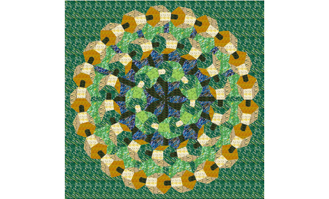
Troy Dugas, Astral Gears, 2012. Product labels on paper. Courtesy the artist and Arthur Roger Gallery, New Orleans.
In the past 25 years, mainstream graphic design has become substantially less graphic and much more anchored by photography. Contemporary product packaging seems not to interest Dugas at all. He prefers unused vintage labels bought and found in bulk, establishing a groundwork of similar hues and shades with hundreds of multiples of the same label cut in various configurations. Sometimes they’re snipped to highlight colors or other features; sometimes they’re processed through a shredder for a randomizing effect.
New series made in the style of Byzantine-mosaics-via-Picasso and floral, blatantly Matisse-like still lives awkwardly announce a modernist allegiance that Dugas arrives at more elegantly in his trademark mandalas. Like with Monet, Seurat, or another contemporary Louisiana-born artist, Wayne Gonzales, a zoomed-in view of most Dugas pieces reveals an alchemy of individual track-laying that satisfyingly snaps into focus from a distance. These works clearly took dozens, maybe hundreds of hours to make, and yet Dugas disguises all that labor by removing a conspicuous human touch with the careful, repetitive placement of his labels. It’s a neat trick, and Dugas respects one aspect of the mandala absolutely: immersing the eye in a fluid thicket of patterning. It’s easy to look at these pieces for a long time.
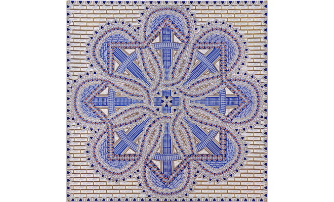
The three-dimensional gear-like shapes made with different shades of green bean and whisky labels in Astral Gears are extremely impressive, and four cigar-label pieces are the show’s most delicate, their gilt sparkling like that dark essence of advertising: fool’s gold. But even at his wittiest, like the fusion of beards in St. Jerome #4, 2012, to produce neat mounds of hair, Dugas’ work doesn’t seem to be about advertising as much as it is cannily exploiting it for his own ends. He doesn’t press the content of his materials on the viewer. You may even miss it. Occasionally the name of a port town might peek out from the lush patterns – like Sandusky in a (unintentional?) moment of topicality--but you’d be hard pressed to make a case that Dugas’ work is dealing with the near-total transference of the manufacturing industry to cheap-labor nations with less (or no) worker rights and environmental regulations. Or of reckless subsidized overproduction, or of an ontological shift in this country that encourages consumption instead of production.

Troy Dugas, St. Jerome #4, 2012. European liquor labels on paper. Courtesy the artist and Arthur Roger Gallery, New Orleans.
Really, it’s about the labels, and to an extent about labeling – branding – as a lure. Like a mandala in the contemporary West, his crisp, unused labels now exist purely as design. And what person of taste would not appreciate the graphic charm of old Ballantine beer labels or the austere handsomeness of the Gallic liquor look? Capitalism, the savviest leech, of course now has its hooks embedded deeply into vintage design. In Dugas’ collages, so much good taste, so fastidiously presented within the form of a largely evacuated signifier, somewhat calls into question what this work conveys aside from good design. There’s a temptation to compare Dugas to Fred Tomaselli, another current artist deeply invested in the use of hypnotic patterning. But the psychedelic and drug connotations of Tomaselli’s work squarely place it into a distinct realm of signification. Dugas seems to be making work – gorgeous work – that avoids it.
Editor's Note
Troy Dugas' "The Shape of Relics" on view through April 20 at Arthur Roger Gallery (432 Julia Street) in New Orleans.


