Personal Realism: Toward the Blue Peninsula
Laurence Ross reflects on a recent photography exhibition at the Ogden Museum of Southern Art and considers individuals’ perceptions of color and place.
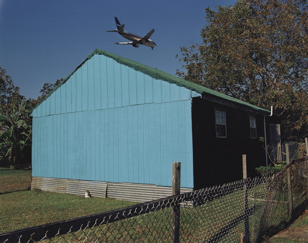
William Greiner, Jet Over Blue and Black House, Kenner, LA, 1994. Chromogenic print. Collection of the Ogden Museum of Southern Art, New Orleans.
It might be easier
To fail—with Land in Sight—
Than gain—My Blue Peninsula—
To perish—of Delight—Emily Dickinson, from “It might be lonelier”
Color is an individual reality, a manner of perception in which people recognize any given shade through layers of personal association. In this context, color photographers must aim to communicate their personal realisms despite the gaps in understanding. Discussing (or writing) about color, in the abstract, seems particularly fraught by the failure of language to convey precisely what is seen or felt. Photographers choose a frame for what they see inside of it: a composition of color, shape, and subject. The form and content of the images can be reported—translated if you will, from sight to language—with comparative ease (even if the desire to understand remains unfulfilled). But color can be exceptionally difficult to articulate, challenging to name, and ultimately as abstract and subjective as taste.
The photographs in “The Colourful South,” an exhibition recently on view at the Ogden Museum of Southern Art, are not abstract images, though they could be thought of that way. Color blocks, focal points of intense color, gradated patinas. William Greiner’s Jet Over Blue and Black House, Kenner, LA, 1994, shows perhaps the most striking field of color in the show: the painted, windowless siding of a house resonating a vibrant blue. As a writer, I want to name the color, to pinpoint the shade with language. I think: sky blue.
In our digital age, colors, like geographic locations, have coordinates. Sky blue, a standardized X11 color name, is close to matching that blue siding on that plot of land on that sun-drenched afternoon, but that shade (RGB 135, 206, 235) in Jet Over Blue and Black House is still not quite right. The deeply angled sun obscures as it illuminates. I am at a loss for further clarity, and now another complication presents itself: The side of the building has conjured, for me, the word “sky” more than the actual hues of the atmosphere suspended above it. It’s doubtful Greiner intended for the viewer to dwell on this color disparity, to encourage the curious mind to wander and wonder in this gap. How closely do our palette-perceptions resemble those of the color photographer? How can we tell without first giving a voice to our sight?
Articulating a precise color with words is inherently problematic, which is perhaps why, from poets to Pantone, those who name color so often resort to metaphor. In attempting to describe a bowl of goldfish in a poem titled “Brilliance,” Mark Doty dashes out a series of attempts: “copper leaf,” “icon-colored,” “bronze chrysanthemums,” “doubloons.” There is no Pantone color named Goldfish, but there is a sandy hue named Starfish (RGB 171, 152, 149), which doesn’t resemble the color of any wine-red starfish I found in my youth, but is a slightly more golden version of the Pantone color Sphinx (RGB 176, 154, 119). Even the professionals seem poised to be stumped.
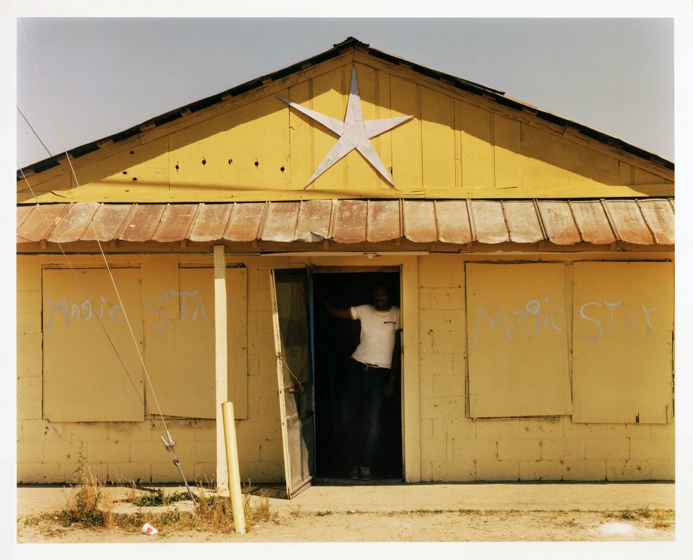
Birney Imes, Magic Star Disco, Falcon, MS, 1984. Chromogenic print. Collection of the Ogden Museum of Southern Art, New Orleans.
Color complicates, which may be one of the reasons many fine-art photographers chose to avoid it for much of the 20th century. In the mid-1960s, most of the art world condemned the medium of color photography as a low-brow method of image production that should be left to commercial advertisers and to the middle class to self-document their domestic lives. Artists like Henri Cartier-Bresson and Ansel Adams denounced color to boost the virtues of black and white, the processes for which the fine-art photographer had prepared, practiced, and in the best instances mastered. If permitted the space, color threatened to usurp that authority, to overthrow the hierophant of tradition with a bombastic sensationalism.
Richard McCabe, curator of “The Colourful South,” highlights this point with a quote from renowned black-and-white photographer Walker Evans, placed at the entrance of the exhibition:
“Color tends to corrupt photography and absolute color corrupts it absolutely. Consider the way color film usually renders blue sky, green foliage, lipstick red, and the kiddies’ playsuit. These are four simple words which must be whispered: color photography is vulgar.”
If there is vulgarity here, it may be that most of these photographs in “The Colourful South” position the viewer as an uninvited guest. We seem to be imposing upon, rather than made privy to, the scenes. In Magic Star Disco, Falcon, MS, 1984, Birney Imes tightly frames the façade of a single-story dance club so closely that the building’s perimeter is out of view. The windows are boarded up; the sun is defiantly in the sky. Yellows abound: the canary triangle that supports the roof, the dull dandelion cinderblock wall, the curry-colored weeds, the straw-shaded foreground. And while a child might use a yellow crayon to draw a star on paper, the shape that hangs as a logo for this dance hall is instead silver. A man stands in the dark doorway, his arm barring the entrance, our access to the interior denied. (Ironically, because what can be gained by remaining just on the precipice of a disco?) The reality of the inside, sheltered from sun, the time of day, and certainly our view, remains a mystery, untold perhaps because it would be untoward to do so—or to try. Questions of etiquette arise, as do problems of permission. In addition to the ciphers of color, is the viewer meant to ponder what lies beyond those private doors?
Blocked or closed entryways are a trope of “The Colourful South.” Returning to Greiner’s photograph, the viewer can observe a sunlit screen door left ajar on an otherwise shadow-drenched side of the house, hinting at the interior, which the viewer cannot see. William Ferris’ Roadside Trailer, Highway 61, North of Vicksburg, MS, 1977, shows a metal trailer with closed doors and curtained porthole windows that suggest there are no fish for sale here, in spite of a green sign advertising the business in hand-painted letters. William Christenberry’s Palmist Building (Winter View), Havana, AL, 1981, shows a weathered office front, obscured by several trees, with knocked out windows and an upside-down sign propped up in the window, presenting a sienna-colored hand as if to say do not enter or fate is not for you to know. There is an interplay of access and withholding throughout the show, and given the works’ geographic specificity, it seems unclear if these photographs amount to an accurate portrait of the South or a skewed perspective. (Though one might assume that a color photograph more accurately captures “real life,” is it possible for any photographic perspective to be truthful or grant full access?)
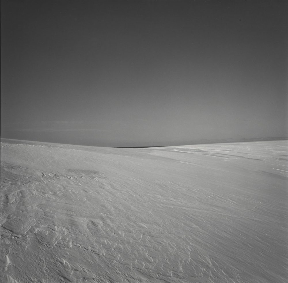
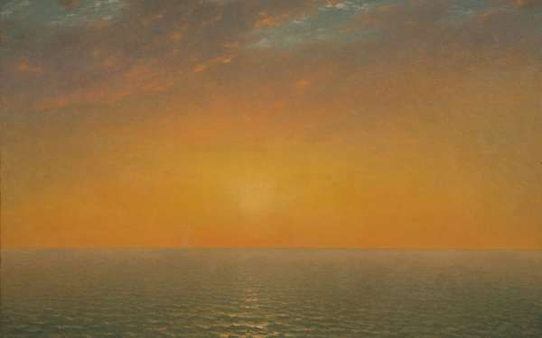
Harry Callahan, Cape Cod, 1974. Gelatin silver print. Courtesy Pace/MacGill Gallery, New York.
In stark contrast, I recall a recent show at the Baltimore Museum of Art, titled “Black, White & Abstract: Callahan, Siskind, White.” I consider what it means to view black-and-white photography in the context of today’s color-saturated megapixel culture, and the choice of black and white seems a different sort of withholding. Though many of these images were shot a couple decades before William Eggleston broke the barrier into the fine-art world with his color photographs, many were printed afterward. Regardless, the technology of color film was available to all of these photographers at the time the images were taken, and, though a token color experiment by Harry Callahan was displayed in the show, Callahan, Aaron Siskind, and Minor White remained rooted to black and white for the duration of their careers.
The intentional withholding of color becomes an interesting action to consider, once the choice to employ color is presented as a viable option for a photographer. For example, Harry Callahan’s Cape Cod, 1974, is a perfect square in which not only color but also all signs of human life are cropped out. There is slanted light cast on wind-swept sands, creating deep, textured grooves like those of an Italian Renaissance relief. There are thin wisps of cloud, low in a corner of an otherwise luminous grey sky. The faintest sliver of ocean can be seen in the center, at the vanishing point, the vastness of the sea whittled down by the angle of the camera.
The selection and amplification of sand, sea, and sky play an enormous role in how this image is conceived and perceived. The form and the content are provocative, precisely because they emphasize the abstract compositions that can be seen within our everyday lives; our intellectual understanding of the idea of “beach” can be changed, charged with a new depth and a new, layered context. But with color removed, Cape Cod is reduced from what might be its full-fledged existence, a possibility withheld by Callahan to better control what it is we see.
I am tempted to attribute the restraint of black and white as something quintessentially belonging to the North. In his essay “Opposite of South,” Sven Birkerts ruminates on the Northern ethos, which he believes contains a “subtle ethics of stoicism.” A first-generation Latvian American born in Michigan, Birkerts’ resonance with all things North seems only bolstered by his current life in Massachusetts. He writes, “What I am really talking about, of course, is my own character, my genetically transmitted, culturally reinforced way of taking in and giving out emotion, my essential rigidity, my held-in nature—my Northernness.” Therefore, if a photograph is colored by the photographer’s perspective or taste, it seems reasonable that a resonance of geography can be found within the aesthetic composition of any given artwork.
“The Colorful South” features five photographers who are engaged in a much different intellectual exercise than some of their more Northern counterparts. With a taste for color, these photographs seem to capture showmanship through a lens of layered decay. The exteriors may be vibrant and eye-catching, but the interiors seem abandoned or wholly undesirable. The viewer is left lingering on the outside, meditating there without a clear depth of dialogue. The viewer is left to ponder the exterior, and perhaps in this way the color really is superficial. When interrogating color, exteriors, or, in this case, the South, we must come up with our own answers or understandings, perhaps because we are still searching for the language with which to establish a more clear-cut communication. Perhaps the language we have is still too vulgar, too unrefined, to articulate a personal realism, a thing as intimate as place.
Editor's Note
“The Colourful South” was on view June 10–October 26, 2017, at the Ogden Museum of Southern Art (925 Camp Street) in New Orleans.