The Remembered and the Forgotten: The South on Display at the ATLBNL
Karen Tauches examines how a revived biennial in Atlanta—the ATLBNL—embraces a multiplicity of Southern histories.
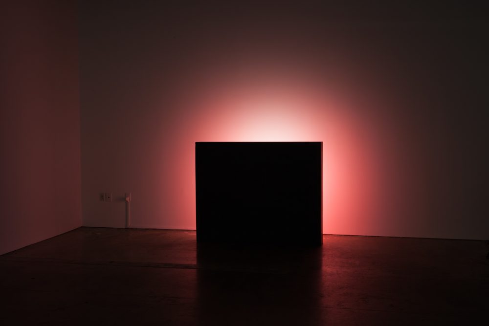
Phillip Andrew Lewis, Distribution in Red, 2016. Light box and vacuum-formed sign. Courtesy the artist. Photo by Erin Jane Nelson.
The word “biennial” is loaded. Exhibitions like the Venice Biennale, the São Paulo Biennial, and the Whitney Biennial have set a standard to which most art scenes in the world aspire. And a slew of other cities have ambitiously created their own similarly iconic traditions: Gwangju, Shanghai, Sharjah, Istanbul, Havana, Sydney, Taipei, Marrakech, Portland, and New Orleans, to name a handful. By contrast, the Atlanta Biennial, styled ATLBNL, at Atlanta Contemporary is almost contrarian in its quest. Instead of mounting an exhibition of international breadth with an unsustainable budget and a need for multiple venues, the ATLBNL curators made a more practical and interesting choice. Reviving a pre-existing biennial, which had been defunct since 2007, they stayed deep inside the region with their selection of artists. And as a result, the work invokes the woods, malls, beachfront convenience stores, and suburbs particular to the Southeast. Rejecting or, at times, making fun of a slick, high-end ethos, the overall style is a synthesis of international contemporary art mixed with familiar archetypes: the outsider, the folk artist, and the craftsperson.
The history and goals of this exhibition are clearly stated: The ATLBNL showcases “emerging, established, and forgotten artistic practices from around the region.” The artists range from those fresh out of college to those practicing for decades. The acknowledgment of the “forgotten” is a nice touch, which enables the curators to showcase a number of art-world outsiders. For example, Mary Proctor was “called” to be an artist in the mid-’90s at the height of the institutional popularization of Folk Art and has been producing paintings ever since. She sells her art in a mall in Tallahassee, Florida. Her bench with pop-up characters from the Last Supper goofily greets visitors at the entrance of the exhibition. Another of Proctor’s pieces is a Howard Finster-style painted door. There’s nothing particularly new in her work, but she’s representative of an important genre that put art from the region on the map.
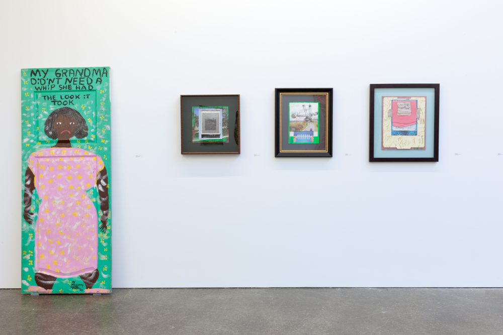
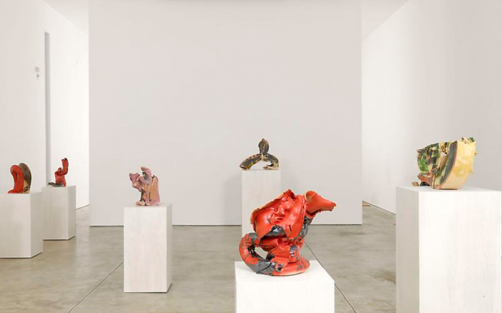
Installation view of works by Mary Proctor and Daniel Newman in the ATLBNL at Atlanta Contemporary. Courtesy the artists. Photo by Erin Jane Nelson.
Guy Church is also an outsider artist, and his work is authentically out of sync with contemporary trends. Most of his pieces are plain graphite compositions on paper, except one in gold paint. His quiet, joyful imagery depicts domestic and hometown scenes. Youthful figures are uniquely abstracted. In Untitled, 2015, a boy stands under a kitchen table as his mother holds out a glass of milk. This strangely out-of-proportion boy is reminiscent of old Madonna portraits where the baby Jesus looks like a diminutive adult. Church is represented by Tops Gallery in Memphis, Tennessee, which is known for its merging of high- and low-art aesthetics. (Tops is housed in a basement coal furnace renovated with impeccable taste. The descriptor “underground” carries an extra layer of meaning here.)
A clear nod has gone out to traditional textiles. Coulter Fussell’s wonderful black and white quilt is certainly an homage to historic Southern quilters. She runs a grassroots textile center called YaloRUN in Water Valley, Mississippi. Including her work over those by artists who want to distance themselves from this sort of crafty identity makes a statement. Several other artists in the show also use textiles, blending the traditionalism of the rural South with the largely urban history of contemporary art. Erin Jane Nelson has made a sort of quilt: Became Ocean, 2016, is a funky, transparent patchworked bag stuffed with styrofoam, hemp, and cheesy ocean trinkets from beachside souvenir stores. Gina Phillips’ lovely collages are composed of stitched-up fabric scraps that attempt to recreate photographs damaged during Hurricane Katrina. Horton Humble makes Tibetan thangka-like paintings on top of “African cloth,” adding acrylic, oil, ink, and marker to create wild, figurative scenes. Pile of People, 2008-13, is a great piece, with its repeating small geometric masks and shields; the people seem to have afros, auras, or angelic discs around their heads.
All this folkiness informs the more fashionable contemporary art pieces. Juxtapositioned behind Mary Proctor’s bench is a sort of redneck, rock-n-roll scene with Stephen Collier’s large USA triptychs, 2015-16, in black and blue. Next to them, a sculpture that looks like a screened-in porch by Tommy Coleman creates a swampy mood. Pinned to the interior are graphite notes with provocative emotional fragments like “That time I tried to catch a litter of kittens for you just before a hurricane,” “Where the deep end ends,” and “Under intimate duress.”
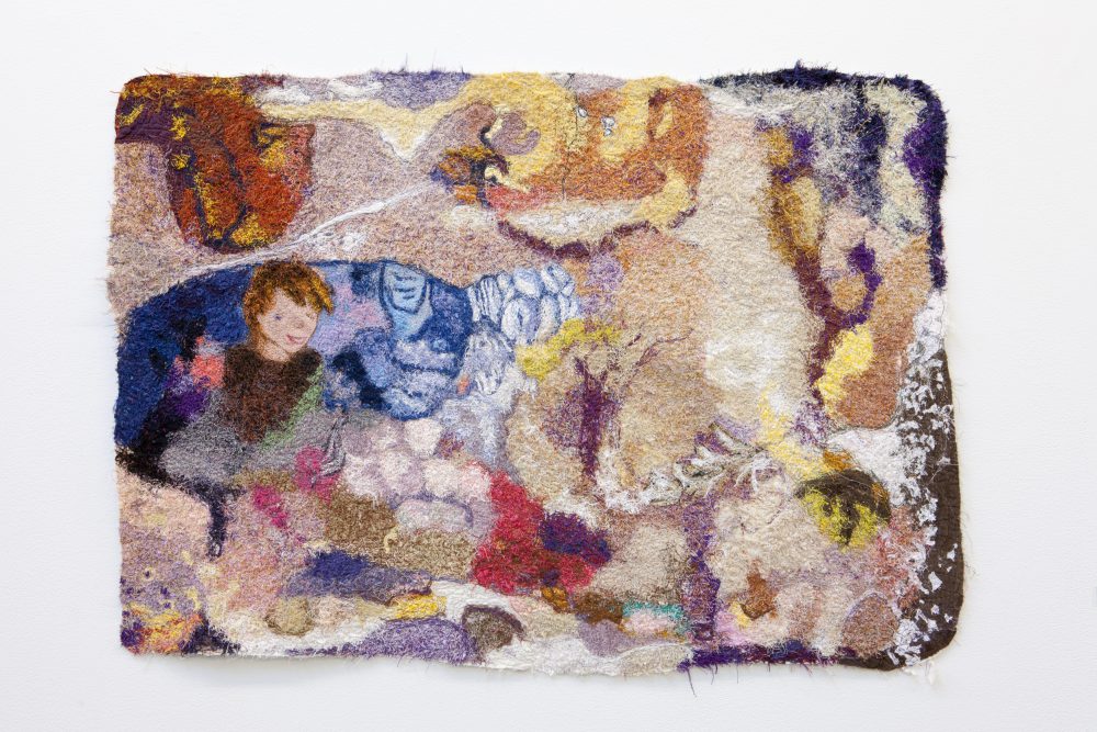
Gina Phillips, 88 Conflates ’74, 2008. Fabric, thread, and acrylic paint. Courtesy the artist and Jonathan Ferrara Gallery, New Orleans. Photo by Erin Jane Nelson.
The biggest celebrity name in this biennial is Harmony Korine, who wrote Kids (1995) alongside director Larry Clark and directed Spring Breakers (2012). He now lives in Nashville, where he was born. An unspecified Atlanta collector lent a recent painting of Korine’s to the show. As a member of the “Beautiful Losers” generation, Korine’s work fits in well with the rest with its casual style, which is scruffy and emotional. His painting’s sunset-colored stripes drag sloppily across the surface over collaged pieces of fabric, and the edges buckle where they are stuffed messily into the corners of the frame.
My favorite piece is tucked away behind a curtain. In a darkened room sits a large, unadorned black box plugged into the wall. Appearing as a kind of James Turrell knockoff, a red glowing light emanates from its back. That tasteful spectacle alone is enough to satisfy, but a reward awaits those who peek behind the box. Distribution in Red, 2016, is a found sign marauding as Minimalism, cleverly placed here by artist Phillip Andrew Lewis. On the other side of the sculpture is a graphic of the internationally renowned king of fried chicken—Colonel Sanders, a perfectly complex symbol of the South. He’s a hasbeen capitalist, and Sanders’ image has been rebranded as the Old South attempts to adapt to new times, a process emphasized by Lewis’ sculpture.
The exhibition text states that “Atlanta, the ‘capital of the New South,’ professes to be a cultural node.” This little quip—“professes to be”—holds an interesting clue. It exposes a skepticism or doubt on the organizers’ parts that Atlanta actually is the node. Not only does it poke at a local insecurity, but it also hints at a new 21st-century paradigm: Is it healthy to be the one dominating art center in a region, or is it better to acknowledge a team of centers, morphing and interacting with one another as individuals do? Most of those who live in the South understand its plurality. I like how the 2016 ATLBNL attempts to promote pride instead of embarrassment of our earthy folk heritage, while also celebrating hipper and newer styles and traditions, a bold gesture of inclusivity. This exhibition makes a clear and clever link between contemporary art and more vernacular art traditions with which the South identifies.
Editor's Note
The ATLBNL is on view through December 18, 2016, at Atlanta Contemporary (535 Means Street NW).